Visualizing folktables
Why the name? folktables is a neologism describing tabular data about individuals. It emphasizes that data has the power to create and shape narratives about populations and challenges us to think carefully about the data we collect and use. (from the GitHub Page)
Introduction
The growing community for fairness in machine learning (ML) has long emphasized the importance of datasets – they are central to the ML ecosystem, not only providing training and test data, but formulating problems and interfacing with academia and industry. In their recent work, Retiring Adult: New Datasets for Fair Machine Learning, Ding et al. (2021) [1] extend the existing data ecosystem for research on fair machine learning and introduce folktables. The package contains multiple binary prediction tasks extracted from a single major corpus of US Census data that relate to income, employment, health, transportation, and housing. As such, it enables systematic studies and benchmarks of ML algorithms for tabular data.
This post. Visual representation of data is a powerful tool for understanding and communicating data, taking full advantage of the human visual system in terms of perception and cognition. The goal of this blogpost is to provide an overview and exploration of the dataset, and present visualizations of the tasks in a way that is useful for ML researchers. These visualizations were done as part of a course project in fall 2022. My hope is that this is of value for anyone that works with folktables, in particular as an explorative, interactive tool.
Outline. There are endless possibilities for how visualizations for folktables can be designed; for this blogpost, my intention was to create a certain storyline: First, I provide an overview of the dataset and its prediction tasks. Then, we dive deeper into possible important features and their signals, plotting them together. After, we focus on the geographical and temporal distribution shifts. Finally, we conclude with an investigation of discrepancies of the target values when dividing the population into groups.
Note: post best viewed on larger screen on desktop.
Disclaimer
Census data is often used by social scientists or economists to study aspects like inequality or sociodemographic properties. This is not the motivation of this project. folktables has been introduced for the empirical study of ML algorithms – and as it is a novel benchmark, the visualizations created on this page can serve as an entry point to working with the datasets and their prediction tasks. For instance, you can find key statistics at a glance and see important features together with their signals which ML algorithms could pick up; it can help you understand the distribution shifts and provide visual insight into the complexities of the data, such as under- or misrepresentation of certain characteristics, in an interactive way.
Overview
The complete data underlying the folktables dataset is simply the full ACS census data, spanning multiple years and all US states. This allows for studying temporal shifts and geographic variations (as is demonstrated later down below). However, the data includes multiple million datapoints each year, and even when filtering task-relevant features, more than 30 columns remain. It is infeasible to consider the whole dataset for visualizations; at the same time, there are endless possibilities for visualizations. As a first goal, let us simply get an overview of the dataset and its prediction tasks.
The tasks. The folktables package has introduced the following classification tasks for the US Census data. You can find a short description of most important features which are used in this post at the very end here.
- ACSIncome (Target feature: PINCP): predict whether an individual’s income is above $50,000, after filtering the ACS PUMS data sample to only include individuals above the age of 16, who reported usual working hours of at least 1 hour per week in the past year, and an income of at least $100.
- ACSPublicCoverage (Target feature: PUBCOV): predict whether an individual is covered by public health insurance, after filtering the ACS PUMS data sample to only include individuals under the age of 65 and those with an income of less than $30,000. This filtering focuses the prediction problem on low-income individuals who are not eligible for Medicare.
- ACSMobility (Target feature: MIG): predict whether an individual had the same residential address one year ago, after filtering the ACS PUMS data sample to only include individuals between the ages of 18 and 35. This filtering increases the difficulty of the prediction task, as the base rate of staying at the same address is above 90% for the general population.
- ACSEmployment (Target feature: ESR): predict whether an individual is employed, after filtering the ACS PUMS data sample to only include individuals between the ages of 16 and 90.
- ACSTravelTime (Target feature: JWMNP): predict whether an individual has a commute to work longer than 20 minutes, after filtering the ACS PUMS data sample to only include employed individuals above the age of 16. The threshold of 20 minutes was chosen as it is the US-wide median travel time to work in the 2018 ACS PUMS data release.
Below is a choropleth map that summarizes the prediction tasks across the US for the year 2018. The color mapping shows the deviation from the US-wide percentage of targets per task; the task is selectable with the dropdown menu. Simultaneously, the right-hand side shows the key statistics (no. of features, datapoints, percentage of positive targets).
| Task (2018) | Features | Datapoints | % of positive targets |
|---|---|---|---|
| ACSIncome | 10 | 1,664,500 | 31.68% |
| ACSPublicCoverage | 19 | 1,138,289 | 26.16% |
| ACSMobility | 21 | 620,937 | 72.78% |
| ACSEmployment | 17 | 3,236,107 | 43.93% |
| ACSTravelTime | 16 | 1,466,648 | 42.10% |
Table: Overview of the key statistics of ACS prediction tasks in 2018.
Hovering over a state shows the description, i.e., state code, target percentage, and count of people. The choice of diverging color scheme was deliberately chosen to upfront show certain geographical contrasts between states; this distribution discrepancy is a theme throughout what follows.
On the search for features to visualize
Now, let us dive deeper into the dataset and prediction tasks. The goal here is to get some understanding of the tasks, in particular of the connection between features and outcomes as well as possible groupings. As outlined in the overview above, the full dataset contains too many features and aspects that could be visualized. As a consequence, we will try to identify a subset of the features that are of predictive performance (or can be of independent interest to other people using the dataset) in order to visualize them. The approach described in this section can be seen as a classic example of exploratory data analysis and/or feature selection (see, e.g., [4, 5])
Feature importance using Gradient Boosting
To have a first investigation of the data – and connect the investigation to the theme of machine learning – I trained a decision tree on all prediction tasks to sort features by their importance for predictive power. The resulting bar plots are shown in Fig. 1 below.
Figure 1: Plotting the feature importance for all 5 prediction tasks (US-wide, 2014) using a classical Gradient Boosting model (GBM) and the mean decrease in impurity (MDI) (not interactive). The colors were randomly chosen and set coherently to be the same for each feature across all plots. The notebook here contains the code to reproduce the bar plots.
The training was done on US-wide data from 2014. I used the gradient-boosted decision tree provided by scikit-learn with exponential loss and num_estimators, max_depth both set to 5, with all other hyperparameters set to the default. This is exactly the same model as the authors of folktables used in their experiments, denoted as the gradient-boosed decision tree (GBM). The feature importance is extracted using the concept of mean decrease in impurity (descriptions available here [6]).
Some interesting observations can instantly be made: for instance, the relationship status (RELP) seems to be a good indicator (for this model) for the mobility task, or the means of transportation to work (JWTR) is of great importance (for this model) for predicting the travel time to work.
NOTE: Impurity-based feature importances have multiple drawbacks and are by no means perfect. Here, they just serve as a simple tool for the first investigation of the data.
Scatterplot matrix
Having identified (possible) important features, let us visualize their relationships with each other as well as the target variable per task. To that end, Figure 2 below shows a scatterplot matrix that visualizes 1000 sample datapoints and the previously identified important features for each prediction task.
Figure 2: The scatterplot matrix that compares the three most important features (as detected by the MDI) for the GBM as well as the target variable. For each prediction task, selectable with the dropdown menu, 1000 samples were taken from the 2014 datasets. The color encodes positive and negative targets. Holding down the shift key enables brushing in order to select certain points in one cell and highlight them across the matrix. For tasks that were identified to have important categorical features (ACSMobility, ACSPublicCoverage), the scatter matrices are replaced by binned scatter matrices (without brushing capability) where the size of the circles indicates the bin count. The samples were taken in the same notebook as the feature importance here.
Scatterplot matrices are a great analytical tool, especially for the first investigation of data as they can show larger quantities. Here, the matrix serves as a first inspector of correlation in the data, and possible clustering effects. For instance, one can see a possible linear correlation between education level (SCHL) and personal income (PINCP) for the ACSIncome task. For tasks that were identified to have important categorical features (ACSMobility, ACSPublicCoverage), the scatter matrices are replaced by binned scatter matrices. The size of the circle indicates the bin count. These plots do not have brushing capability. Similar to scatterplots, it enables the observation of clustering effects, e.g., if the bins tend to be larger for positive targets for certain feature categories.
A closer look at distribution shifts
Of particular interest to this dataset and benchmarking of ML algorithms is the concept of distribution shifts. The ACS PUMS prediction tasks present two natural axes of variation: geographic variation between states and temporal variation between years of the data collection.
To explore these distribution shifts, Fig. 3 shows a ridgeline visualization of selected features, side-by-side to a barplot that takes into account the population size additionally separated by gender.
Figure 3: The ridgeline plot that shows the density variation for selected features, together with a bar plot indicating the full population size (male and female) across states. 10’000 samples per state were taken (or less if the initial count is lower) from the general ACS data (not task-specific). Hovering over the densities reveals the state code & mean and highlights the selected density. The diverging color scale encodes the feature mean, where the midpoint is set to the US-wide mean for the selected feature. The vertical order can be chosen between sorted (by mean and thus color) or fixed (alphabetical). Changing the year with the slider triggers transitions between plots. The Python code that was used to extract samples can be found here.
Ridgeline plots are of great value when the number of groups to represent is large, whereas a classic plot per group would take too much space; allowing the densities to overlap uses space more efficiently. This dataset is thus a clear use case for such plots, using important features such as personal income or age distribution per state which are a large number of groups. The plots work well when there is a clear pattern in the result (e.g., if there is a clear separation or shifts); if there is not, the plot brings this to light.
This is the most interactive of the visualizations and it has multiple interesting channels. First, the diverging color scheme (as before) allows us to quickly grasp the gap and shift between states (characterized by the means). Hovering over the densities reveals the state code and mean and highlights the selected density. One can choose between two orderings of the states: the first one orders them by the mean (and thus also the color), whereas the second keeps them in alphabetical order. The first is insightful to, e.g., follow the trend of a particular state when moving the year slider and following the transitions up/down. The second is insightful when looking at the transition of the density of a particular state over time, for example, if a density moves to the right or left. As noted by the authors in the original folktables paper, their experiments showed relatively stable fairness metrics over time, with a slight degradation in accuracy; this is also largely reflected in the ridgeline plots, where no strong shifts can be identified easily.
Focusing our attention to the right, we have the barplot that shows the sample size split per gender and state. In particular, this is ordered in the same way as the left in order to take into account the sample size and representation when comparing ridgeline distributions. Similar to the ridgeline plot, the bars change with respect to the selected year.
Why do we care?
Let us come back to the main motivation of folktables and, by extension, this visualization. Why is it important? At its core, folktables is part of years of active research into algorithmic fairness. We aim to better understand our ML algorithms, how we design and train them, and their societal impact. This involves understanding the complexities of the data that is used to train and evaluate models, and what impact it can have on individuals.
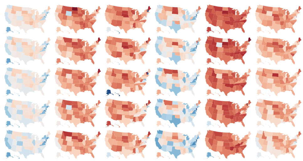
Having looked at both correlation and grouping effects, as well as distribution shifts, the last focus of our visualizations is the contrast between different population subgroups as well as their representation in the dataset. This visualization is a matrix grid split by year (rows) and ethnical groups (columns). The first matrix shows the percentage of positive targets (where the task is selectable) with a diverging color scheme that has the US-wide mean at its center; the second matrix shows the sample size. The two resulting matrices are visible in Fig. 4 and Fig. 5.
Target indicators grouped by ethnicity and state
Figure 4: Choropleth matrix grid split by year (rows) and ethnical groups (columns). The color encodes the percentage of positive targets (where the task is selectable) with a diverging color scheme that has the US-wide mean at its center. Hovering over a state reveals the percentages, state ID and population count for the task.
Perhaps unsurprisingly, Figure 4 shows a strong variation between population subgroups and states. The percentage of positive targets varies widely, with some states having a much higher percentage as well as groups than the US-wide mean; notable examples are states like CA or NJ for white or Asian groups. Being aware of such discrepancies is important when training and evaluating models.
However, as mentioned in the original folktables paper, there can be few individuals with particular characteristics (e.g., ethnicity) in certain states, and generalizing conclusions from these few individuals may be highly inaccurate. Further, benchmarking fair machine learning algorithms on datasets with few representatives of certain subgroups may provide the illusion of “checking a box” for fairness, without substantive merit. This sparsity becomes apparent when hovering over the map and looking at the counts of samples; even more so, it is visible with a colormap that indicates the population size, shown below.
Looking at the size of the samples
Figure 5: Choropleth matrix grid split by year (rows) and ethnical groups (columns). The color encodes the sample size per target after filtering for task specifications (where the task is selectable). The logarithmic color scale was chosen to better encode the size information which was almost entirely lost for linear scales.
This visualization clearly illustrates the over- and underrepresentation of different groups. Note that the logarithmic color scale was chosen to better encode the information which was almost entirely lost for linear scales; there are numerous states and groups with a sample size of less than 100 or 1000. Consider e.g. African Americans or American Indians in the northern states. The west and east coast, on the other hand, are largely in the range of tens to hundreds of thousands of samples.
Combining both matrices, they perfectly illustrate inherent problems that can arise when training and evaluating ML models on datasets with few samples of certain groups. A larger sample size generally translates to higher importance for the model, which further amplifies algorithmic bias.
Citing
If you find this post useful, please cite it in your work:
@misc{haegele2022folktables,
  title={Visualizing folktables},
  author={Alexander H\"agele},
  year={2022},
  month={Fall},
  url={https://haeggee.github.io/posts/folktables},
  note={Interactive visualizations and exploratory data analysis of the folktables dataset for fair machine learning research}
}
Technical details
All (sub-) datasets were extracted in Python notebooks from the folktables package and stored in CSV or JSON files which are loaded interactively with JavaScript in the browser. The respective notebook is linked to at the appropriate locations. The visualizations were created with Vega-Lite [2] (choropleth maps, scatterplot matrix) and D3 [3] (ridgeline plot).
Feature descriptions
The most important features used in the visualizations are summarized here for completeness. The full description of categories and other features is available in the original folktables paper in the Appendix as well as the documentation for the ACS data.
- AGEP: age in years, max. 99
- DIS: Disability recode (1: with disability, 2: without)
- ESR: Employment status recode (categorical values 1-6)
- JWMNP: Travel time to work, max. 200 (in minutes or NA)
- MIG: Mobility status, lived here 1 year ago (categorical values 1-3, or NA; 1: same house)
- MIL: Military service (categorical values 1-4, or NA)
- OCCP: Occupation – Please see ACS PUMS documentation for the full list of occupation codes
- PINCP: Total person’s income (integers between -19997 and 4209995 income in US dollars)
- RAC1P: Recoded detailed race code (categorical values 1-9)
- RELP: Relationship (categorical values 1-17)
- SCHL: Educational attainment (categorical values 1-24, or NA)
- SEX: Sex/Gender (1: Male / 2: Female)
- WKHP: usual hours worked per week past 12 months, max. 99 (or NA)
References
[1] Frances Ding, Moritz Hardt, John Miller, and Ludwig Schmidt. Retiring Adult: New Datasets for Fair Machine Learning. Advances in Neural Information Processing Systems, 34:6478–6490, 2021. ArXiv Link
[2] Arvind Satyanarayan, Dominik Moritz, Kanit Wongsuphasawat, and Jeffrey Heer. 2017. Vega-Lite: A Grammar of Interactive Graphics. IEEE Transactions on Visualization and Computer Graphics 23, 1 (January 2017), 341–350. https://doi.org/10.1109/TVCG.2016.2599030. Documentation
[3] Mike Bostock (2012). D3.js - Data-Driven Documents. Link
[4] Inria Learning Lab. Feature importance. scikit-learn @ La Fondation Inria. Link
[5] Jason Brownlee. How to Calculate Feature Importance With Python. Machine Learning Mastery, 2020. Link
[6] scikit-learn documentary: Feature importance with a forest of trees. Link